So, you’re checking all the boxes for what you need to start your new business. Lo! The logo hasn’t been done yet! You know you need it like yesterday. So you make up your mind to do it yourself hoping the turnaround time will be faster.
At a time when online logo makers are by the dozens, generating a logo for your brand takes only a few clicks and no money. However, that can come at a cost to your brand depending on the output you get.
A logo is the first thing that your audience will see in your new business. Will it say your brand is unique? A good logo is one mark of good branding for a small business. It can give a good first impression and a lasting one at that. That’s the foundation of many good businesses.
Granted, you do not need to be a graphic designer to make your logo. Yet, a professional logo that will stand the test of time and speak well for your brand ought to be solid. Some principles apply to logo designing and you can adhere to them too even as you choose the DIY path.
1. Research And Know Your Target Market
Know your audience by understanding their demographics. Know their age, gender, location, income level, education, and occupation. Different demographics may respond to visual elements such as colors, fonts and imagery differently, and will help inform your design choices.
The values, lifestyles, and interests of your target audience will influence your logo design. For example, a logo targeting luxury travelers will have a different approach compared to a logo targeting adventure enthusiasts.
Another example is, the process of making a logo for women’s clothing will not be similar to one of making a logo specific for men’s clothing.
Get feedback from friends and family on the look of the look and how they perceive it. Depending on the feedback, refine and optimize the logo for the intended audience to achieve the desired impact.
2. A Logo Should Be Legible
A legible logo is important when it comes to brand recognition. Legibility ensures that the logo leaves a lasting impression on viewers, helping to build brand familiarity.
The legibility of a logo enables the communication of a brand’s message clearly and effectively. Your audience will quickly grasp the information conveyed by the logo, its elements, and its tagline.
Hence, your brand identity, values, and offerings are easily captured.
Making your logo legible is also crucial in conveying the message that your brand is professional and credible. It tells your market that your logo was not an afterthought hence enhancing your brand’s reputation and trustworthiness.
Finally, by prioritizing legibility, your brand accommodates individuals with visual impairments or other reading difficulties. This makes your brand inclusive enabling you to reach a wider audience.
3. A Logo Should Be Scalable
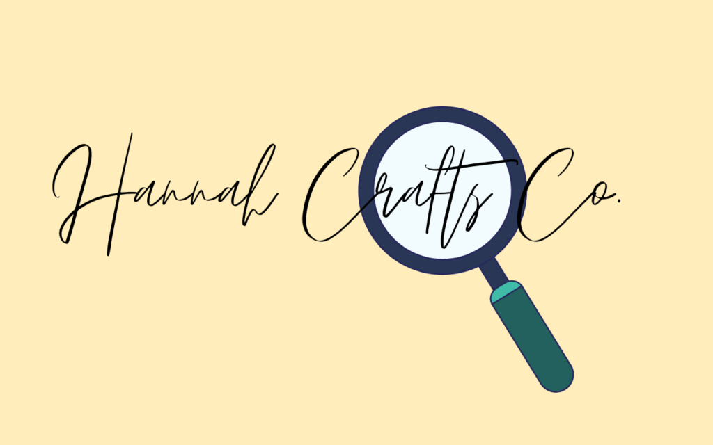
A well-designed logo should maintain its visual integrity and clarity in different sizes. You will use your logo on your business card, social media platforms, websites, pens, or banners. A scalable logo can be adjusted to be applied on large or small sizes without losing its visual appeal or becoming distorted.
To help make the logo scalable without losing its clarity, avoid making it too detailed. Avoid surface styles such as drop shadows, and engraving to enhance the look.
A logo that is designed in a vector file format is perfect for scalability. Vector file formats are svg, eps, and ai. Avoid using your logo in raster formats such as png and jpg. Scaling a logo in this format will cause it to become pixelated.
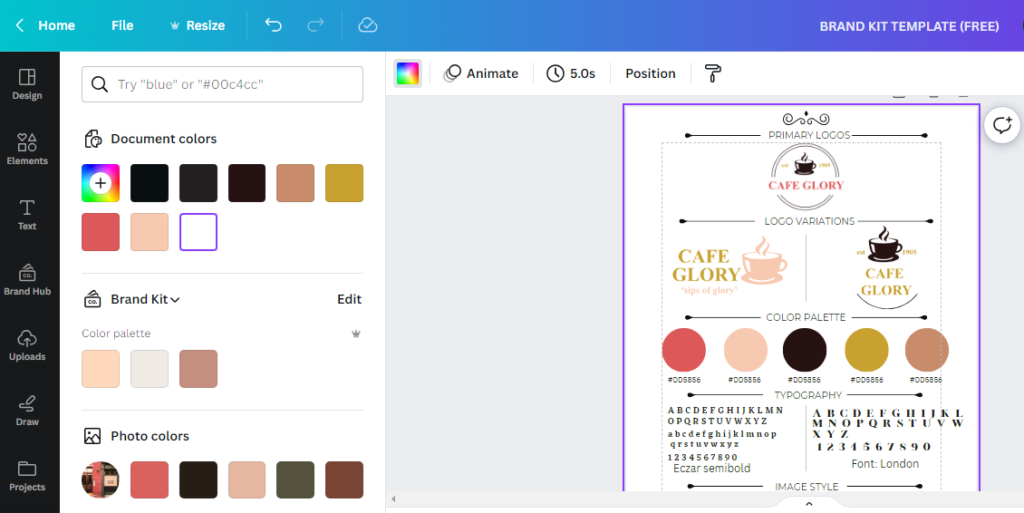
If using Canva to design a logo, Canva Pro will enable you to download yours as an svg which is a vector format.
Inkscape is a free and open-source vector graphic software that can help you create an svg logo. It is good for non-designers.
Adobe Illustrator is the industry standard vector graphic software. It is highly professional with a learning curve. Unlike Inkscape, it is not free. If you intend to design high-quality logos for sale, Adobe Illustrator is more versatile and provides a rich tool set.
4. A Logo Should Have Variations
After taking some time to design your logo, you go ahead to upload it on your social media profile and alas, it cannot fit. You reduce its size and unfortunately, it is no longer legible.
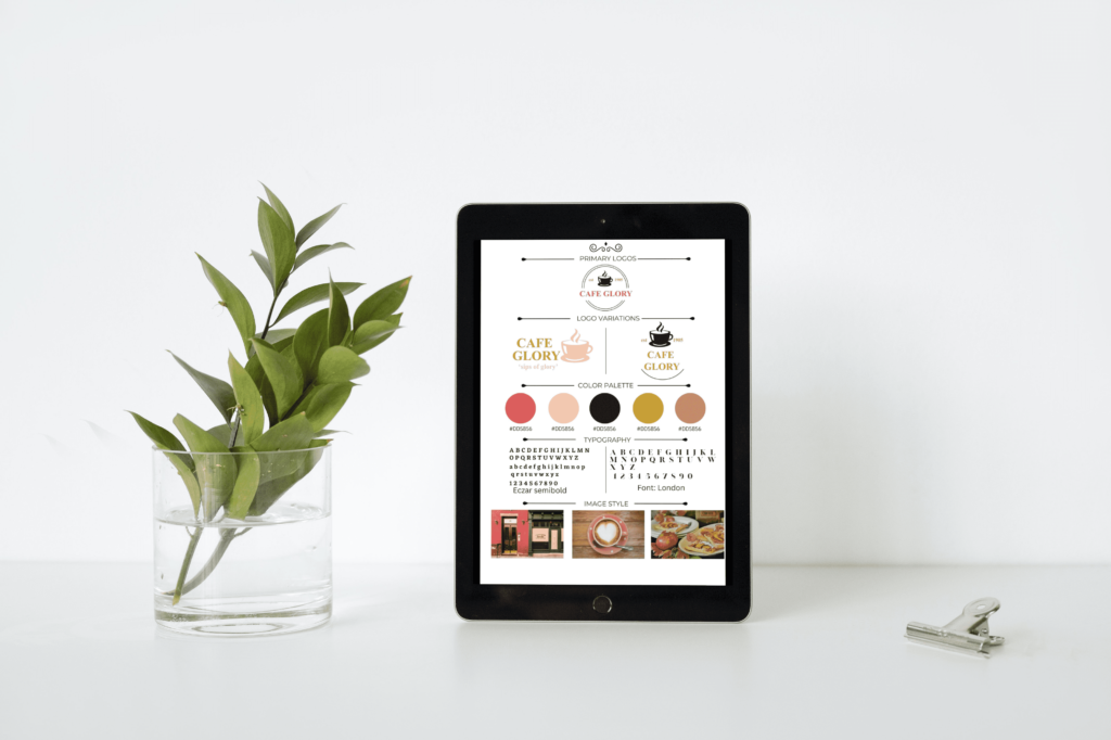
This problem can easily be solved by having one or two more variations of your primary logo. Logo variations are intended to accommodate the brand’s logo on a platform they are applied to maintain brand consistency.
The logo that appears on your business card may not be the same as the one that appears in your Instagram profile.
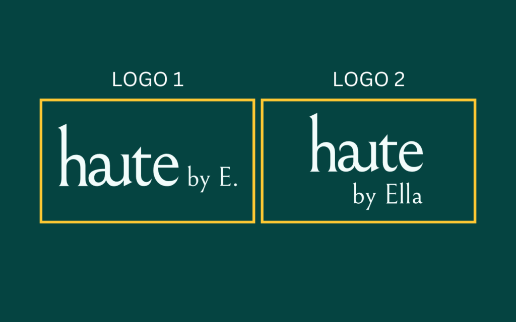
A simple primary logo can be your full name. Its variations can be the full names plus its initials or the initials only. Aim to keep it simple.
5. A Logo Should Be Easily Printed On A Light Or Dark Background
Having picked your color profile and designed your logo in one or some of the colors, it will be a bummer to notice that the logo cannot be printed on certain backgrounds.
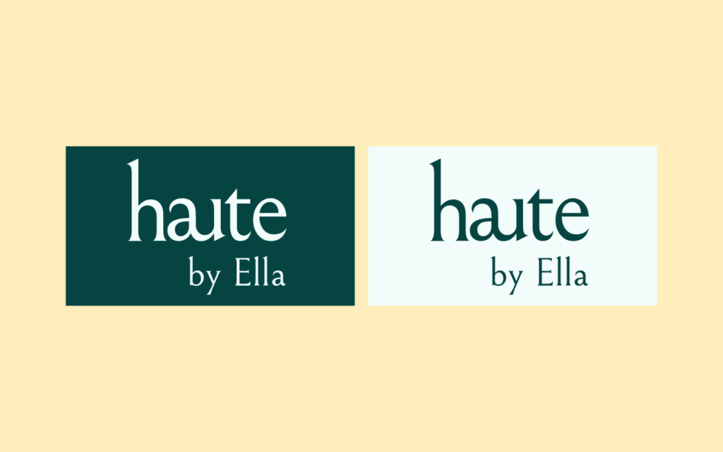
An adaptable logo should allow for its use on both light and dark backgrounds. In picking your colour scheme, have this in mind. This will enable you to switch to the optimal colour for the logo if needed to be placed on a specific background colour.
6. A Logo Should Not Be Too Wordy
Hannah Makel’s Gingerbread Bakery on a logo would be considered wordy. How about H.M. Gingerbread Bakery? Much better.
A logo’s primary purpose is to create a visual representation of a brand or company. Memorability is key. A logo with excessive text tends to be difficult to remember.
When a logo is too wordy, it can result in visual clutter. This can make it difficult for viewers to focus on essential elements, hence compromising the brand’s intended message.
To effectively use a logo on various mediums, its scalability is key. A wordy logo can become illegible when scaled down to a smaller size.
It’s important to create a simple and minimalistic logo. This makes it easily legible, effectively communicates the conveyed message, and leaves a memorable impression.
7. Use One To Two Colors In A Logo
At the time of creating your logo, it is advisable to design it in one color- black. This enables you to focus on the overall logo design without color distractions. It also enables you to view various elements clearly.
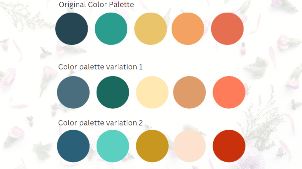
Once you have your logo ready use one or at most two colors from your profile. Your color palette communicates what your brand is about. The colors you use on the logo should convey this very message. You can bet that the colors you use on your logo will be among the top reasons your target audience recognizes you.
Understanding Color theory and color psychology and knowing what various colors represent is key in enabling a brand to come up with a color palette. The color palette one picks can have a big impact on the message it conveys hence influencing buying decisions.
8. Use One Font In A Logo
Like colors, different fonts in a logo convey different messages. Using an elegant font in a logo meant for children’s clothing may not be most appropriate. A playful or handwritten font would be more appropriate.
The two main things to consider when choosing a font to use on your logo are your target audience and your brand’s personality. Beyond that, what’s also critical is seeing to it that the font is legible.
Keeping these simple rules in mind while crafting your logo will give you an impactful and timeless one in no time.
Now, go and DIY your logo like a pro!

